SAMPLE EPT FOR STUDENTS CFS IIUM
(Task 1 and Task 2)
TASK 1
Actually graph ada bnyak tau..but kita tekankan 3 sahja yer..Bese nie yng ditnya dalam exam~
1) Bar graph
2) Line graph
3) Pie chart
Next,sebanrnya model answer kat bawah semua mnggunakan bhasa yang sangat tinggi..hhaha.
1)First INTRODUCTION----------------------->
Example : The graph above shows the number of students from different courses in CFSIIUM in 2013.
The courses included are Engineering,Physical science,Law and Dentists.
(Korang buat dalam satu ayat ke dua ayat..jngn pnjng sangat tau)
2) Second BODY GRAPH------------------------------>
Example : It can be seen clearly that,there are two basic general trends,upward and downward.
Dalam pragh2 ni korng kene bnyak compare,tngok mna yng the highest and the lowest.
Bese kan guna perkataan DIBAWAH :
*Besides *Increased slightly
*On the other hand *Rose rapidly
*However *Significant decrease
*In contrast *Level out
*Similarly *Dramatic fall
*In Conclusion *Reached A peak
*In can be seen clearly that
*It obviously shows that
3) LAST PARAGRAPH-------------------------------->
Example : In conclusion,it obviously shows that the percentage of car ownership with two cars is higher than three or more cars.
MODEL 1
Write a report for a university lecturer describing the information in the graphs below.
- You should write at least 150 words.
- Allow yourself 20 minutes for this task.
model answer:
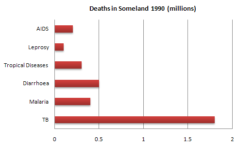
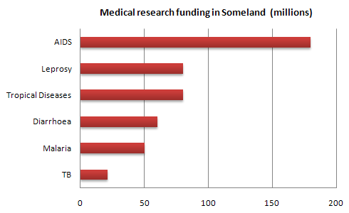
The graphs compare the number of deaths caused by six diseases in Someland in 1990 with the amount of research funding allocated to each of those diseases. It can be clearly seen that the amount of research funding in many cases did not correlate with the seriousness of the disease in terms of numbers of deaths.
In 1990 there were around 0.2 million deaths from AIDS, 0.1 million deaths from leprosy, 0.3 million deaths from tropical diseases, 0.5 million deaths from diarrhoea, 0.4 million deaths from malaria and 1.8 million deaths from TB. These figures can be contrasted with the amount of funding allocated for each disease. In 1990 AIDS received 180 million dollars in research funding, leprosy 80 million dollars in research funding, tropical diseases 79 million dollars in research funding, diarrhoea 60 million dollars in research funding, malaria 50 million dollars and TB 20 million dollars in research funding.
In conclusion it is clear that funding allocation for disease research in Someland is not wholly determined by the number of deaths for which each disease is responsible in a given year.
MODEL 2
You should spend about 20 minutes on this task.
The two graphs show the main sources of energy in the USA in the 1980s and the 1990s.
Write a report for a university lecturer describing the changes which occurred.
Write a report for a university lecturer describing the changes which occurred.
Write at least 150 words.
model answer:
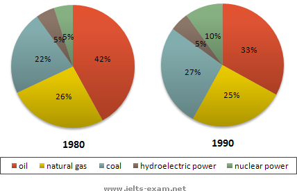
The two graphs show that oil was the major energy source in the USA in both 1980 and 1990 and that coal, natural gas and hydroelectric power remained in much the same proportions. On the other hand, there was a dramatic rise in nuclear power, which doubled its percentage over the ten years.
Oil supplied the largest percentage of energy, although the percentage decreased from 42% in 1980 to 33% in 1990. Coal in 1990 was the second largest source of energy, increasing its proportion to 27% from 22% in the previous decade. Natural gas, the second largest source in 1980 at 26%, decreased its share very slightly to provide 25% of America’s energy ten years later. There was no change in the percentage supplied by hydroelectric power which remained at 5% of the total energy used. Nuclear power the greatest change: in 1990 it was 10%, twice that of the 1980s.
Oil supplied the largest percentage of energy, although the percentage decreased from 42% in 1980 to 33% in 1990. Coal in 1990 was the second largest source of energy, increasing its proportion to 27% from 22% in the previous decade. Natural gas, the second largest source in 1980 at 26%, decreased its share very slightly to provide 25% of America’s energy ten years later. There was no change in the percentage supplied by hydroelectric power which remained at 5% of the total energy used. Nuclear power the greatest change: in 1990 it was 10%, twice that of the 1980s.
(152 words)
MODEL 3
You should spend about 20 minutes on this task.
The graph below gives information about the preferred leisure activities of Australian children.
Write a report for a university lecturer describing the information shown.
Write a report for a university lecturer describing the information shown.
You should write at least 150 words.
model answer:
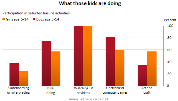
The graph shows the preferred leisure sctivities of Australian children aged 5-14. As might be expected, it is clear from the data that sedentary pursuits are far more popular nowadays than active ones.
Of the 10,000 children that were interviewed, all the boys and girls stated that they enjoyed watching TV or videos in their spare time. In addition, the second most popular activity, attracting 80% of boys and 60% of girls, was playing electronic or computer games. While girls rated activities such as art and craft highly – just under 60% stated that they enjoyed these in their spare time – only 35% of boys opted for creative pastimes. Bike riding, on the other hand, was almost as popular as electronic games amongst boys and, perhaps surprisingly, almost 60% of girls said that they enjoyed this too. Skateboarding was relatively less popular amongst both boys and girls, although it still attracted 35% of boys and 25% of girls.
Of the 10,000 children that were interviewed, all the boys and girls stated that they enjoyed watching TV or videos in their spare time. In addition, the second most popular activity, attracting 80% of boys and 60% of girls, was playing electronic or computer games. While girls rated activities such as art and craft highly – just under 60% stated that they enjoyed these in their spare time – only 35% of boys opted for creative pastimes. Bike riding, on the other hand, was almost as popular as electronic games amongst boys and, perhaps surprisingly, almost 60% of girls said that they enjoyed this too. Skateboarding was relatively less popular amongst both boys and girls, although it still attracted 35% of boys and 25% of girls.
(157 words)
MODEL 4
You should spend about 20 minutes on this task.
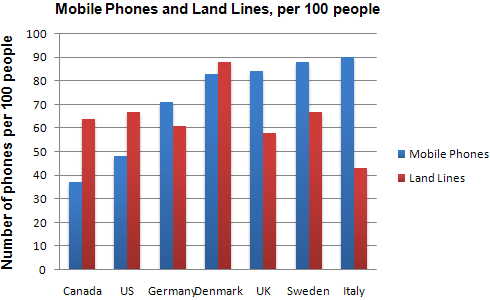
The chart shows the number of mobile phones and landlines per 100 people in selected countries.
Write a report for a university lecturer describing the information given.
Write a report for a university lecturer describing the information given.
You should write at least 150 words.
model answer:
The graph shows the number of mobile phones and landlines per 100 users, for selected countries. Overall, most of the countries included in the graph have more mobile phones subscribers than landlines.
Most European countries have high mobile phone use. The biggest users of mobile phones are the Italians, with 88 cell phones per 100 people. For example, Italy has twice as many mobile phones as landlines, with 88 mobiles per hundred people compared to 45 for landlines. Mobile phone use is low in Canada, with fewer than 40 phones per 100 people. Denmark is also unusual because it has slightly more landlines than mobile phones.
However, in some countries, the number of landlines is higher than the number of mobile phones. One example is the USA, where the number of mobiles, at 50 per 100 people, is much lower than the number of landlines, at almost 70 per hundred. A similar pattern can be seen in Canada. The highest number of landlines in the graph is in Denmark, with about 90 per 100 people. In contrast, the lowest figures for fixed lines are in Italy and the UK.
In conclusion, it seems that mobile phone use is higher in Europe than in North America.
MODEL 5
You should spend about 20 minutes on this task. Write a report for a university lecturer describing the information in the graph below. You should write at least 150 words.
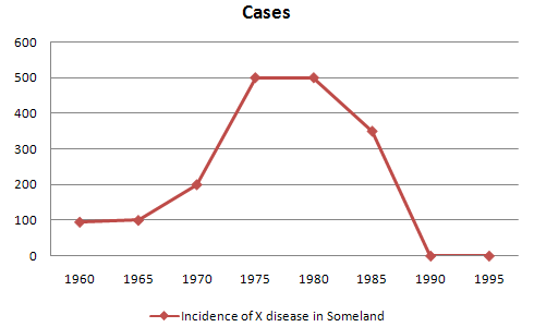
The graph shows the number of cases of X disease in Someland between the years 1960 and 1995. As an overall trend, it is clear that the number of cases of the disease increased fairly rapidly until the mid seventies, remained constant for around a decade at 500 cases before dropping to zero in the late 80s.
In 1960, the number of cases stood at approximately 100. That number rose steadily to 200 by 1969 and then more sharply to 500 in 1977. At this point the number of cases remained stable until 1984 before plummeting to zero by 1988. From 1988 to 1995 Someland was free of the disease.
I n conclusion, the graph shows that the disease was increasingly prevalent until the 1980s when it was eradicated from Someland.
TASK 2
EXAMPLE 1